Many things differ between a UI kit and a design system, and one of those is the UX design aspect.
Let’s say your UI kit has three types of buttons: filled, stroke and ghost, but how to use them in terms of prioritisation, grouping or alignment (left/right/centred) is an open question for a designer, unless your design system has a guideline of the UX patterns that regulate such cases.
Different products have different patterns, for example, the confirmation footer of the dialogues (modals, popovers, dropdowns etc.).

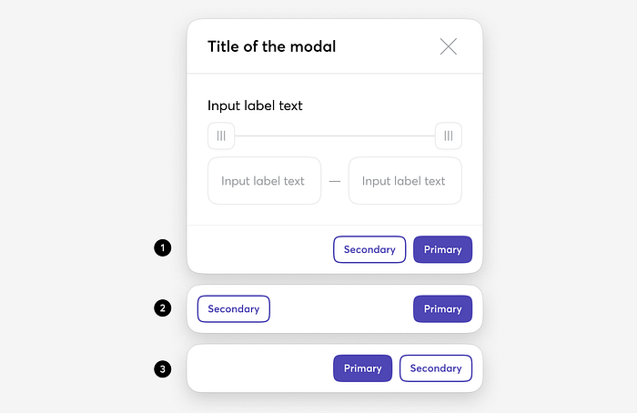
Example 1: Apple (Mac OS), Google (Material)
The Primary action is on the right and grouped with the Secondary action (Tertiary action is on the left if needed).

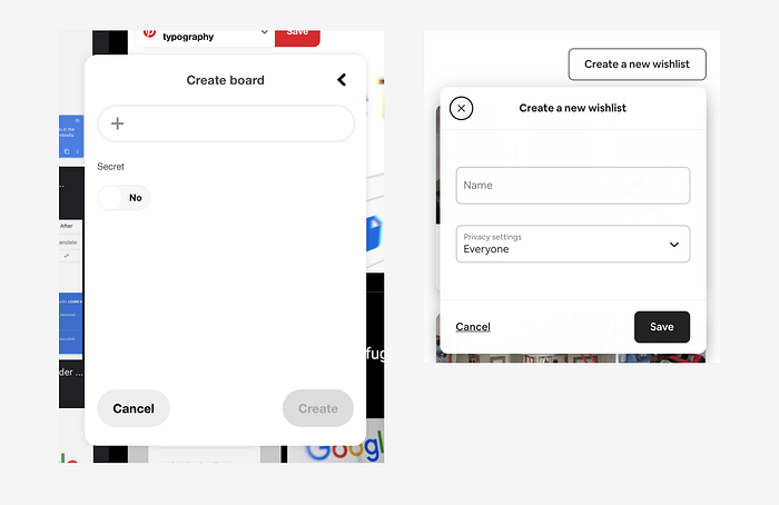
Example 2: Pinterest, Airbnb
Pretty much the same as the first example above (primary is on the right), especially on mobile or small dialogues. On desktop, however, Primary and Secondary actions are usually spaced to the right and left.

It’s also worth mentioning, though, that we’ve noticed that this approach isn’t consistent for both Pinterest or Airbnb. Sometimes they don’t stick to their rules; the Secondary button and close “X” are present in some dialogues (modals, popovers) and not in others.


Example 3: Atlassian, Windows
Primary and Secondary actions are grouped on the right, where Secondary also goes first from the right.

After this research, we decided to go with the 1’st approach. Moon Design System supports globalisation in UX patterns, meaning that our users will experience the same patterns as native Mac/IOS and Google Material users. Other than the fact that this approach is used by Apple and Google, it also seems more logical and consistent.
Figma
In the Moon Design System, designers already have all the components that include a confirmation footer in the library, so they don’t need to figure out what pattern they have to apply here and there.
The designers can choose a variant of the header module and footer from Figma variants of the component:


In “Moon”, we strongly recommend having the Primary button in Fill or Stroke styles while the Secondary and Tertiary buttons can be in the same style.

So the buttons are just one example used here to illustrate the impact of the UX design logic on UI kit — that’s what Moon Design System is about.
Links
Figma file: Moon DS on Figma community
Moon DS website: Moon.io
GitHub
